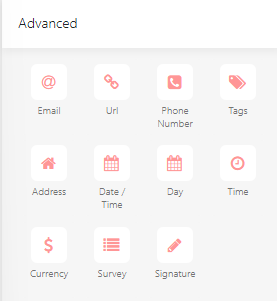
Advanced Components
Advanced input and interactive components available in the Form Designer, including specialized validation fields, date/time pickers, and signature canvases.
Email
Data type: String
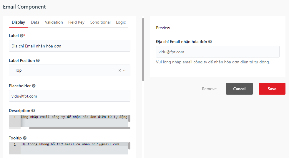
You can use the Email component to input email addresses. This component includes built-in validation to ensure the input follows the standard email format.
Url
Data type: String
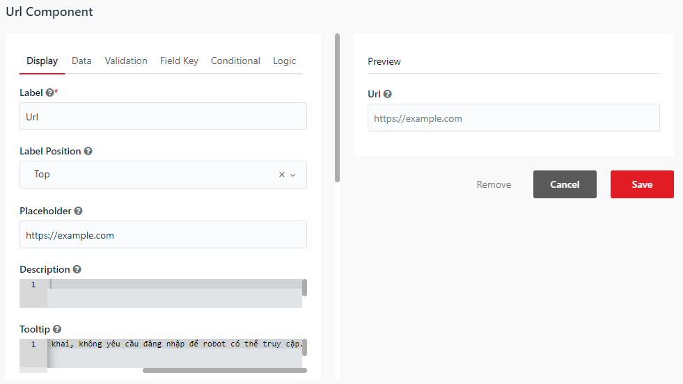
You can use the Url component to input web addresses. This component includes built-in validation to ensure the input follows the standard URL format.
Phone Number
Data type: String
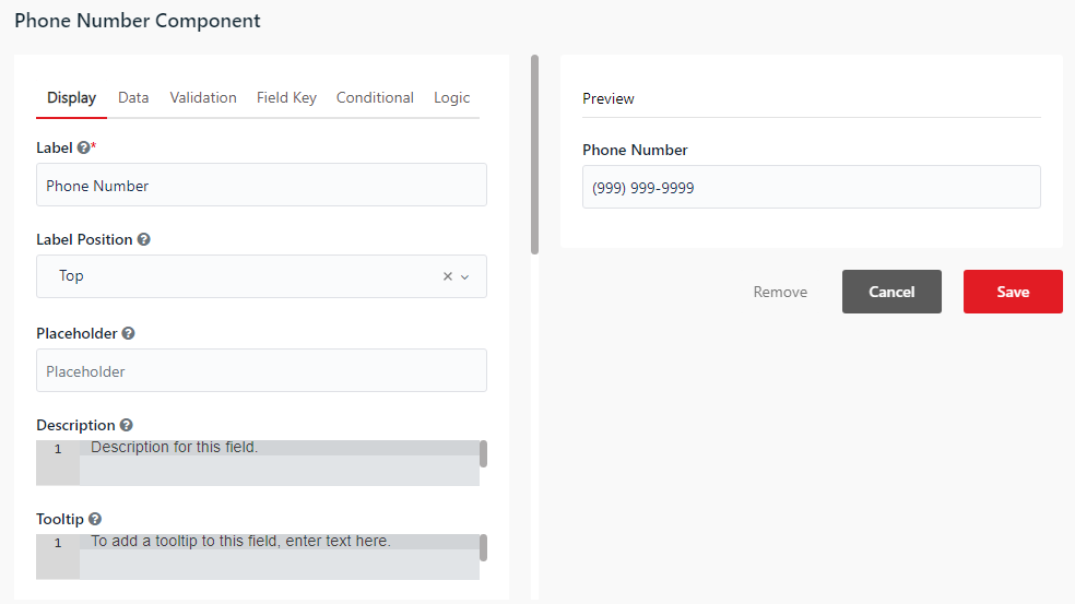
You can use the Phone Number component to input telephone numbers.
- Input Format - Enforces a specific formatting template for the input digits (e.g.
(999) 999-9999).
Tags
Data type: JArray (Array of Strings)
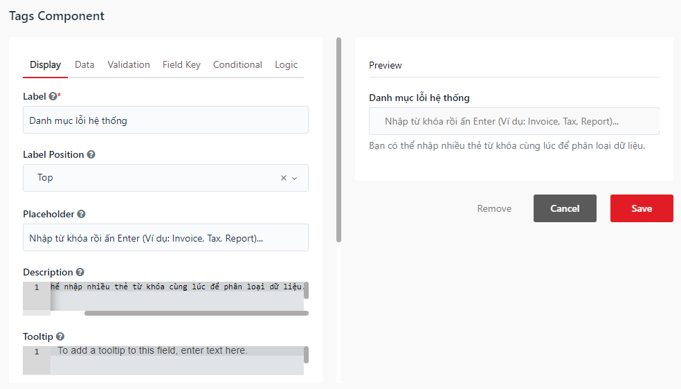
You can use the Tags component to allow users to enter and manage multiple label tags in a single field.
- Max Tags - Sets the maximum number of tags a user can add to the field.
Address
Data type: JObject
You can use the Address component to search and auto-complete physical addresses. It integrates with external mapping providers to return structured address data.
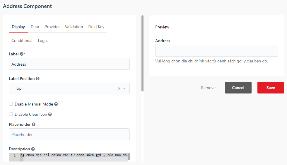
- Provider - Select the search provider for address auto-completion (e.g. Google Maps, Azure Maps).
Date / Time
Data type: String or DateTime
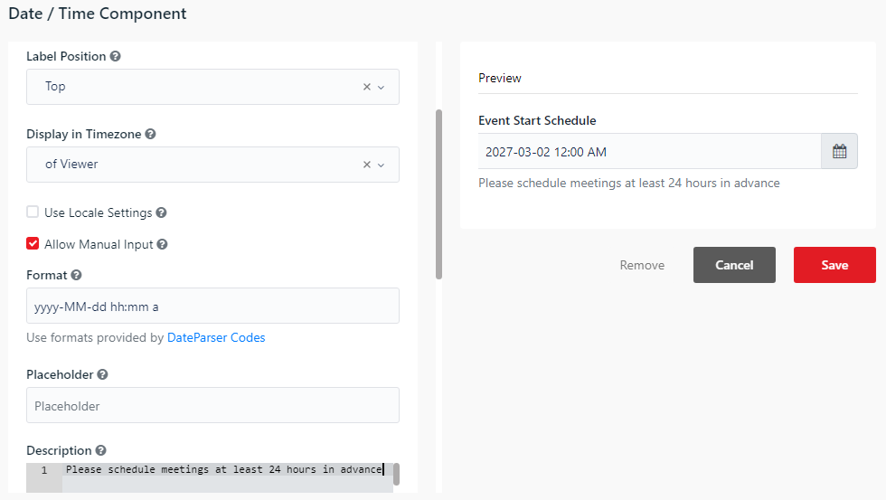
You can use the Date / Time component to select dates, times, or both using a dropdown calendar and time picker.
- Enable Date - When checked, allows users to select a date.
- Enable Time - When checked, allows users to select a time.
- Format - The display format of the date/time (e.g.
yyyy-MM-dd HH:mm).
Day
Data type: String (e.g. "01/12/1990") or JObject (if day/month/year are split)
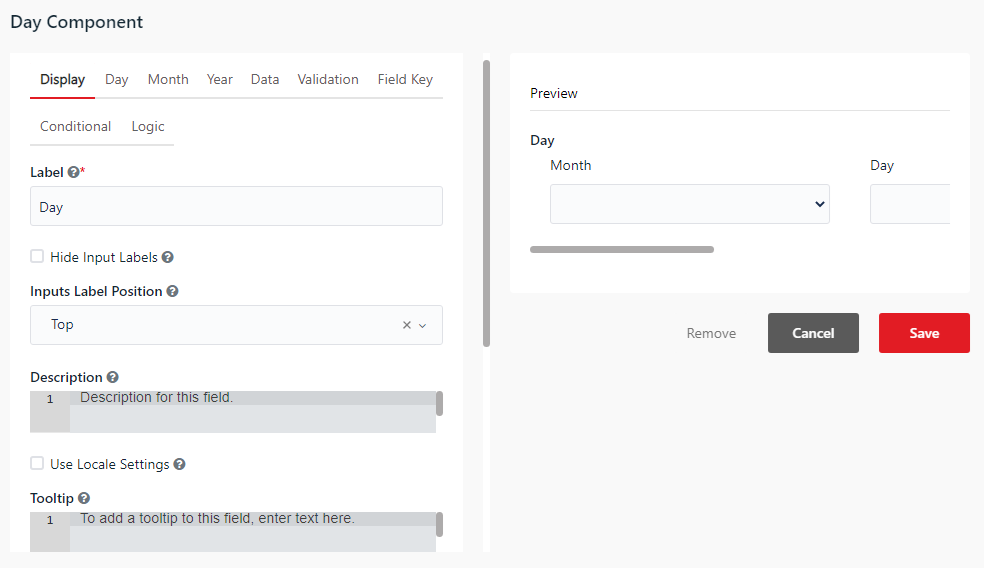
You can use the Day component to input a date (day, month, and year) using separate dropdown select lists or numeric inputs.
- Day - Displays the Day selection field before the Month.
- Inputs - Choose whether to display input fields as dropdown selections or numeric text fields.
Time
Data type: String (e.g. "HH:mm")
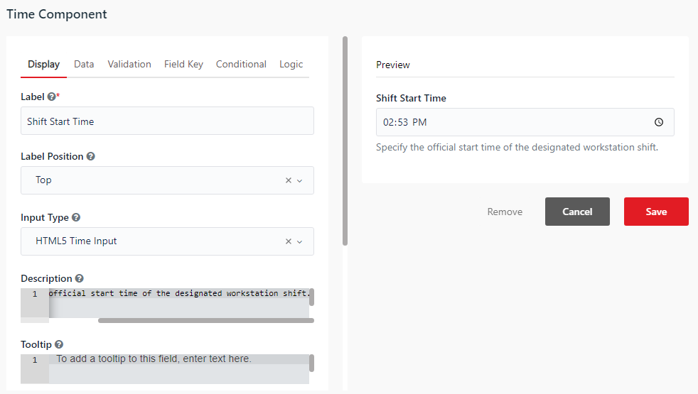
You can use the Time component to input specific times (hours and minutes) using a clock picker or formatted text mask.
- Format - Sets the time entry format (e.g.
HH:mmfor 24-hour format).
Currency
Data type: Double
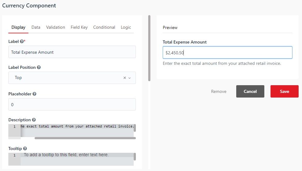
You can use the Currency component to input monetary amounts. It automatically formats the input with a currency symbol and thousand/decimal separators.
- Currency - Select the currency symbol to display (e.g.
USD,VND).
Survey
Data type: JObject
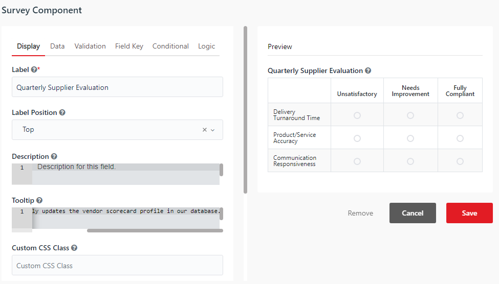
You can use the Survey component to display a matrix grid of radio buttons. It allows users to answer multiple questions in a single survey layout.
- Questions - Define the questions displayed as rows in the survey grid.
- Values - Configure the options (columns) available for each question.
Signature
Data type: String (Base64-encoded PNG image data URI)
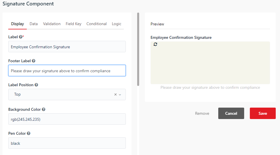
You can use the Signature component to capture handwritten signatures. Users can sign their name directly on the interactive drawing canvas using a mouse, touchscreen, or stylus.
- Pen Color - Sets the color of the signature stroke.
- Background Color - Sets the canvas background color.