Form Controls
When designing form layouts in the visual Form Builder editor, you can customize the appearance, behavior, data mapping, and validation rules of each component.
Double-clicking any component on the design canvas opens a configuration wizard window containing six core tabs: Display, Data, Validation, Field Key, Conditional, and Logic.
Overview
| Wizard Tab | Description | Special Mentions |
|---|---|---|
| Display | Configure the way the form component is displayed. | The name you set in the mandatory Label field becomes the Property Name in the Field Key tab. |
| Data | Configure a default value that end users see in the text field. | Components that may hold multiple items (e.g., Selectboxes, Tab) can be defined here. |
| Validation | Configure validation requirements to enable other UI components. | NA |
| Field Key | Configure the property name of the component that you want to use in the workflow. | By default, this value is passed from the Label field of the Display tab. |
| Conditional | Configure conditions for the component. | You can set advanced conditions, such as JavaScript or JSONLogic. |
| Logic | Configure the logic that triggers the conditions. | NA |
1. Display
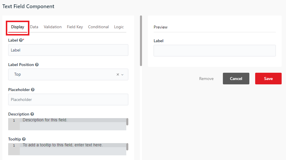
The Display tab controls the component's visual look-and-feel, widget rendering type, layout properties, and placement in the active form window.
Label - The title of the component.
Label Position - The position of the label for a field.
Placeholder - The text that appears when the field is empty.
Description - The text that appears below the input field.
Tooltip - Adds a tooltip icon next to the field label. Input the text of the tooltip.
Prefix - The text that is displayed before a field.
Suffix - The text that is displayed after a field.
Widget - The rendering style of the input control (e.g. Input Field, Calendar).
Input Mask - Enforces a predefined formatting mask template (e.g. for phone numbers).
Display Mask - The formatting mask layout displayed to the user as they type.
Allow Multiple Masks - Allows defining multiple input masks on the same component.
Custom CSS Class - Add a custom CSS class to the component. You can add multiple classes, separated by a space.
Hidden - Hide a component when you show the form.
Hide Label - Hide the label of a component.
Show Word Counter - Displays a real-time word counter below the input field.
Show Character Counter - Displays a real-time character counter below the input field.
Hide Input - Masks the entered characters, keeping them hidden on the screen.
Initial Focus - Places cursor focus on this component automatically when the form first loads.
Allow Spellcheck - Enables the browser's default spellcheck mechanism for user inputs.
Disabled - Disable a field in the form. You can enable it dynamically using the Enable activity.
Execute DO on change - (Only available for Checkbox, Selectboxes, Select, and Radio components) When checked, any change to this field's value will trigger the workflow's DO block dynamically.
Table View - Shows the component value in the table layout when nested within container components.
Modal Edit - Opens a popup modal window to edit the component value.
2. Data
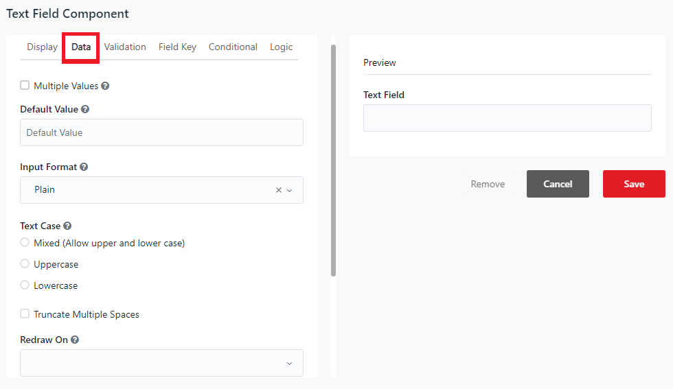
The Data tab controls default values, dynamic array lists, dropdown options, and character processing rules.
Multiple Values - When checked, multiple values can be added to the field. The values appear as an array in the submission data.
Default Value - The value of the field before users interact with it. The default value overrides the placeholder text.
Input Format - Controls how text input is parsed (e.g. Plain).
Text Case - Enforces text input casing (Mixed, Uppercase, or Lowercase).
Truncate Multiple Spaces - Automatically collapses consecutive spaces entered by the user into a single space.
Redraw On - Redraw this component if another component in the form changes. Choose the redraw event from the dropdown list.
Clear Value When Hidden - Clears the field value automatically when the component gets hidden.
Custom Default Value - Allows writing custom JavaScript or JSONLogic code to calculate the default value dynamically.
Calculated Value - Allows writing custom JavaScript or JSONLogic code to calculate and assign the value dynamically based on other fields.
Custom Default Value
The following variables are available in all scripts:
| Variable | Description |
|---|---|
| form | The complete form JSON object |
| submission | The complete submission object. |
| data | The complete submission data object. |
| row | Contextual "row" data, used within DataGrid, EditGrid, and Container components |
| component | The current component JSON |
| instance | The current component instance. |
| value | The current value of the component. |
| moment | The moment.js library for date manipulation. |
| _ | An instance of Lodash. |
| utils | An instance of the FormioUtils object. |
| util | An alias for "utils". |
Expand either of the collapsible panels to define your script logic:
- JavaScript - Write custom JS code. The result must be assigned to the
valuevariable. - JSONLogic - Define logic rules using a standard JSONLogic schema.
Calculated Value
The following variables are available in all scripts:
| Variable | Description |
|---|---|
| token | The decoded JWT token for the authenticated user. |
| form | The complete form JSON object |
| submission | The complete submission object. |
| data | The complete submission data object. |
| row | Contextual "row" data, used within DataGrid, EditGrid, and Container components |
| component | The current component JSON |
| instance | The current component instance. |
| value | The current value of the component. |
| moment | The moment.js library for date manipulation. |
| _ | An instance of Lodash. |
| utils | An instance of the FormioUtils object. |
| util | An alias for "utils". |
Expand either of the collapsible panels to define your script logic:
-
JavaScript - Write custom JS code. The result must be assigned to the
valuevariable. -
JSONLogic - Define logic rules using a standard JSONLogic schema.
3. Validation
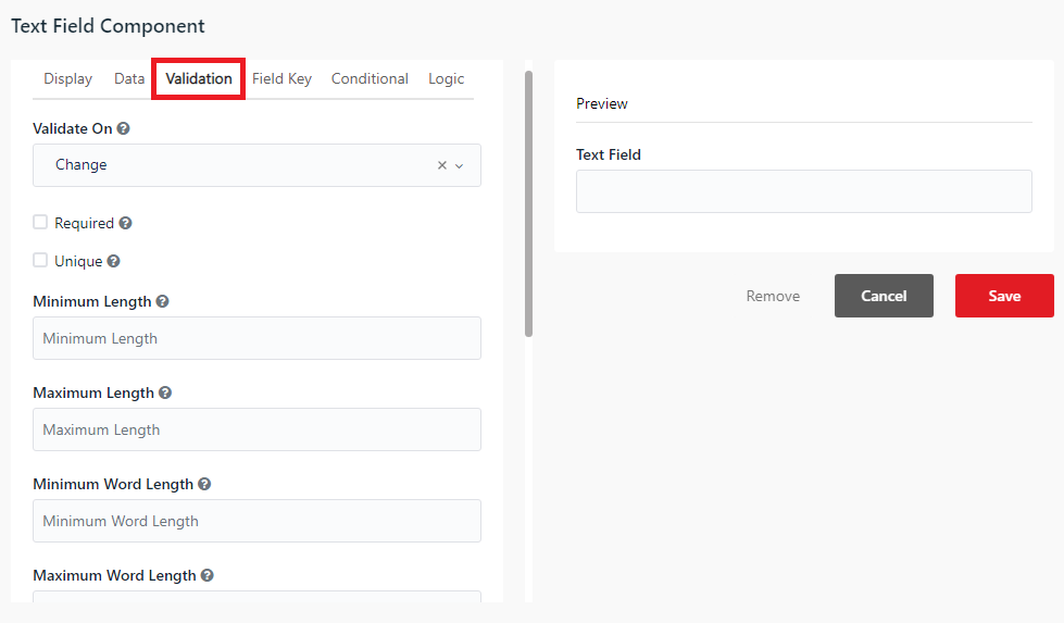
The Validation tab manages client-side form validation, displaying red outline alerts and blocking form submission if the data does not comply.
Required - When checked, this field is required to have a value.
Validate On - Determines when this component triggers front-end validation. Choose an event from the dropdown list: Change or Blur.
Minimum Length - The minimum length requirement this field must meet.
Maximum Length - The maximum length requirement this field must meet.
Regular Expression Pattern - The regular expression pattern that the component must pass before the form can be submitted.
Error Label - The label that displays when a validation error message shows.
Custom Error Message - A customized error message to be displayed if an error occurs.
4. Field Key
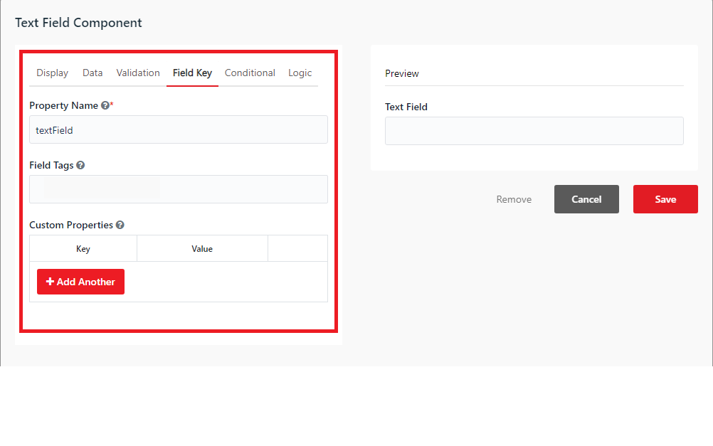
The Field Key tab defines how akaBot Studio identifies and interacts with the form component in the automation workflow.
Property Name - Configure the property name of the component that you want to use in the workflow. This value binds the field to dynamic activities (such as Get Element Value and Set Element Value).
Field Tags - Custom tags associated with the component.
Custom Properties - Custom key-value metadata pairs added to the component JSON schema.
5. Conditional
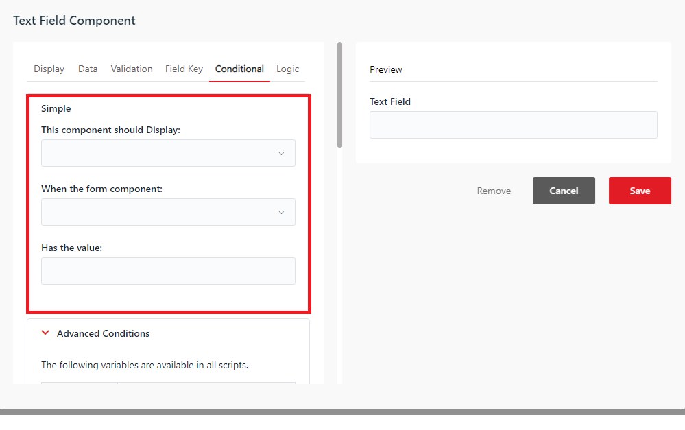
The Conditional tab configures conditional rules to show or hide fields dynamically depending on how the user interacts with other parts of the form.
Simple Conditions
Simple conditions hide or show the target component based on a single trigger field.
- This component should Display: Choose
Trueif you want to condition when the component displays, orFalseif you want to condition when it hides. - When the form component: Choose a component in the form to act as a condition.
- Has the value: Type in the value that conditions the component when to display or hide.
Advanced Conditions
Advanced Conditions allow you to write custom JavaScript logic or JSONLogic schemas to construct complex rules.
[IMPORTANT]
- Advanced JavaScript logic overrides standard Simple conditional settings.
- The special Boolean variable
showmust be assignedtrueorfalseto set the visibility.
The following variables are available in all scripts:
| Variable | Description |
|---|---|
| form | The complete form JSON object |
| submission | The complete submission object. |
| data | The complete submission data object. |
| row | Contextual "row" data, used within DataGrid, EditGrid, and Container components |
| component | The current component JSON |
| instance | The current component instance. |
| value | The current value of the component. |
| moment | The moment.js library for date manipulation. |
| _ | An instance of Lodash. |
| utils | An instance of the FormioUtils object. |
| util | An alias for "utils". |
Expand either of the collapsible panels to define your conditional logic:
-
JavaScript - Write custom JS code. The result must be assigned to the
showvariable. -
JSONLogic - Define visibility rules using a standard JSONLogic schema.
6. Logic
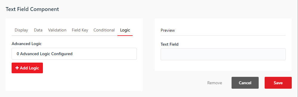
The Logic tab allows you to configure advanced reactive flows to dynamically change properties, default values, or CSS styles without modifying the underlying JSON schema file.
Under this tab, the Advanced Logic section displays all configured logic rules (showing 0 Advanced Logic Configured if empty). Click the + Add Logic button to define a new rule to dynamically change properties, default values, or values of the component based on trigger conditions.