Basic Components
Basic input and selection components available in the Form Designer, including text fields, checkboxes, and buttons.

Text Field
Data type: String
You can use the Text Field component to input short text.
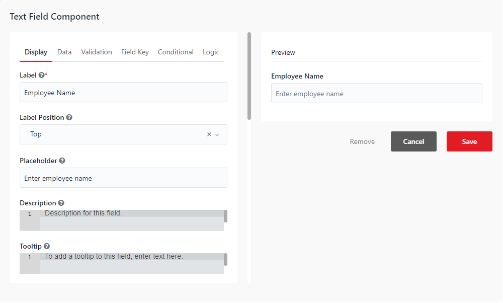
Tip: You can retrieve or set values of these components in your akaBot Studio workflow using the Get Element Value and Set Element Value activities. Mapped keys must match the component's Property Name on the Field Key tab.
Text Area
Data type: String
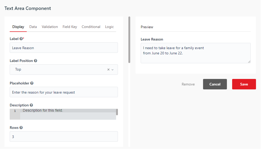
You can use the Text Area component to input long text. The Text Area component offers multi-line input.
- Rows - Set how many rows are visible in the Text Area component.
Number
Data type: Double or Int32
You can use the Number component to input any number value.
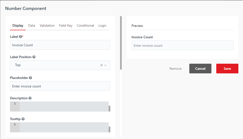
- Use Thousands Separator - Separates thousands with a comma.
- Require Decimal - Always shows decimals, even if 0.
- Decimal Places - Sets the maximum number of decimal places to display.
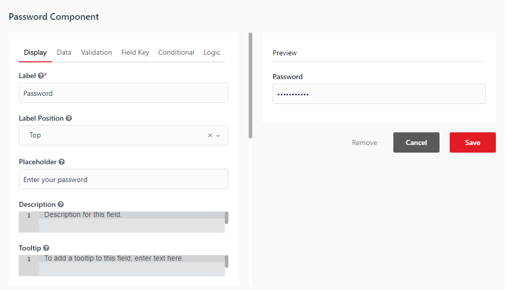
Password
Data type: String
You can use the Password component to input confidential credentials. The text is displayed as asterisks instead of the actual value entered for secrecy.
Checkbox
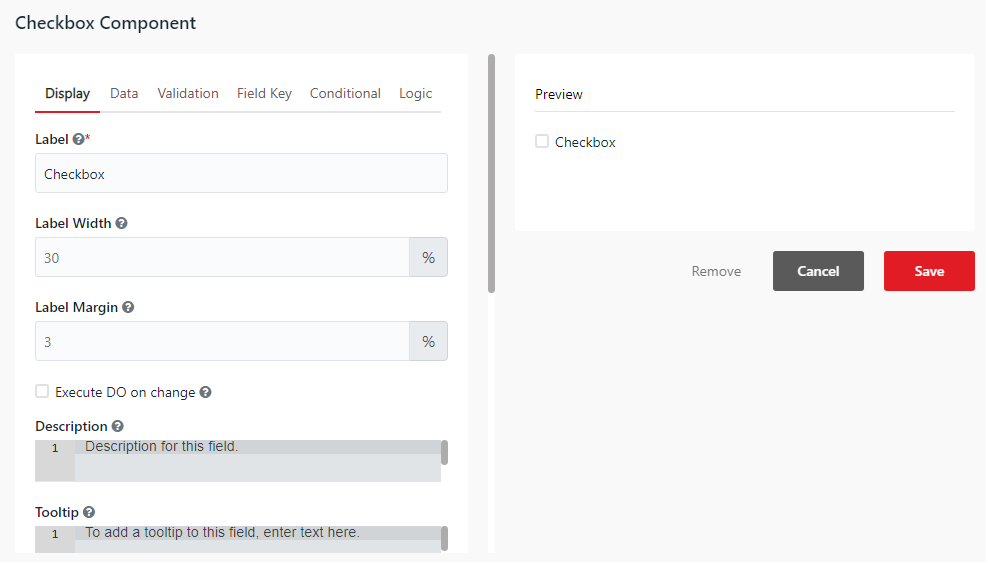
Data type: Boolean
You can use the Checkbox component to input boolean values (true or false).
- Execute DO on change - When checked, triggers the workflow's Do block execution automatically whenever the checkbox state changes.
Select Boxes
Data type: JObject
You can use the Select Boxes component to allow users to choose multiple values from a list of checkboxes. The output data is returned as a JSON object containing keys mapped to boolean values indicating the checked state of each option.
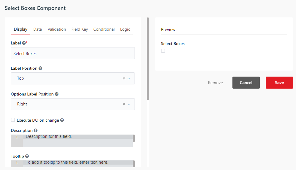
- Options Label Position - Sets the position of the labels for each checkbox option (e.g. Left, Right).
- Execute DO on change - When checked, triggers the workflow's Do block execution automatically whenever any checkbox option's state changes.
- Values Mapping - Adds options to your Select Boxes component. The Label column is the text visible to users. The Value column is the key name stored in the submission data.
Select
Data type: String (or JArray if multiple values are enabled)
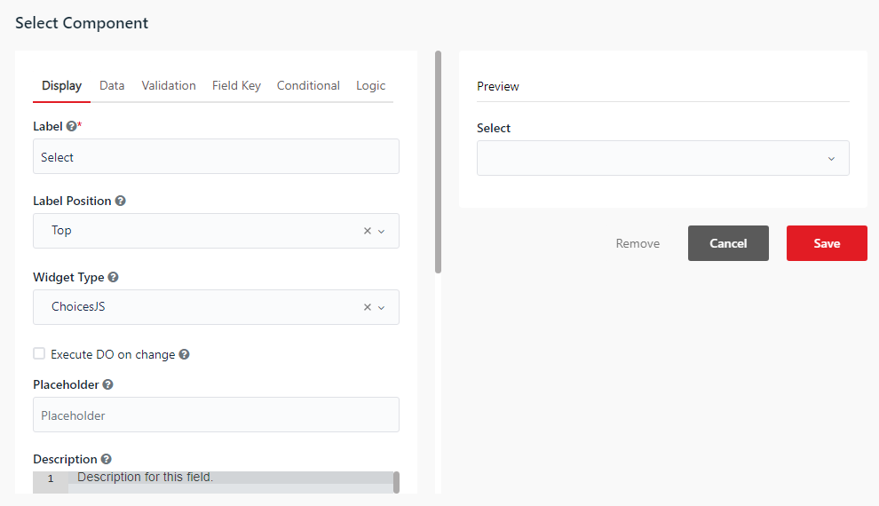
You can use the Select component to display lists in a dropdown format.
- Execute DO on change - When checked, triggers the workflow's Do block execution automatically whenever the selected option changes.
- Data Source Type - Choose the source of dropdown options (Values, JSON, URL).
- Values Mapping - Configure static options. The Label column is the text visible to users. The Value column is the name stored in the data.
Radio
Data type: String
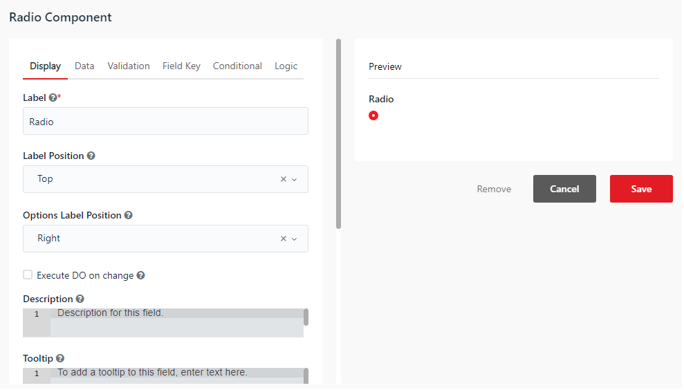
You can use the Radio component to allow users to choose only one value from a list of radio buttons.
- Execute DO on change - When checked, triggers the workflow's Do block execution automatically whenever the selected option changes.
- Values Mapping - Define options that appear in the list. The Label column is the text visible to users. The Value column is the key name stored in the data.
Button
Data type: None (Triggers actions and submits the form)
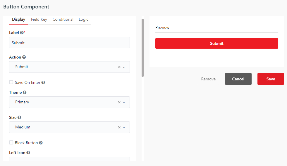
You can use the Button component to allow users to perform various actions in the form.
- Action - Select the action you want the button to perform:
- Submit - Submits the form data and closes the window.
- Reset - Resets all form fields to their default values.
- Event - Emits a custom event name to trigger advanced logic rules.
- Custom - Executes a custom JavaScript expression.
- Theme - Choose the color style of the button from the dropdown list.
- Size - Choose the size of the button from the dropdown list.
- Block Button - Stretches the button to the full width of its bounding container.
- Left Icon / Right Icon - Add a font icon class.