Layout Components
Layout and container components available in the Form Designer, including column grids, panels, tables, and tabbed pages.

HTML Element
Data type: None (Layout container)
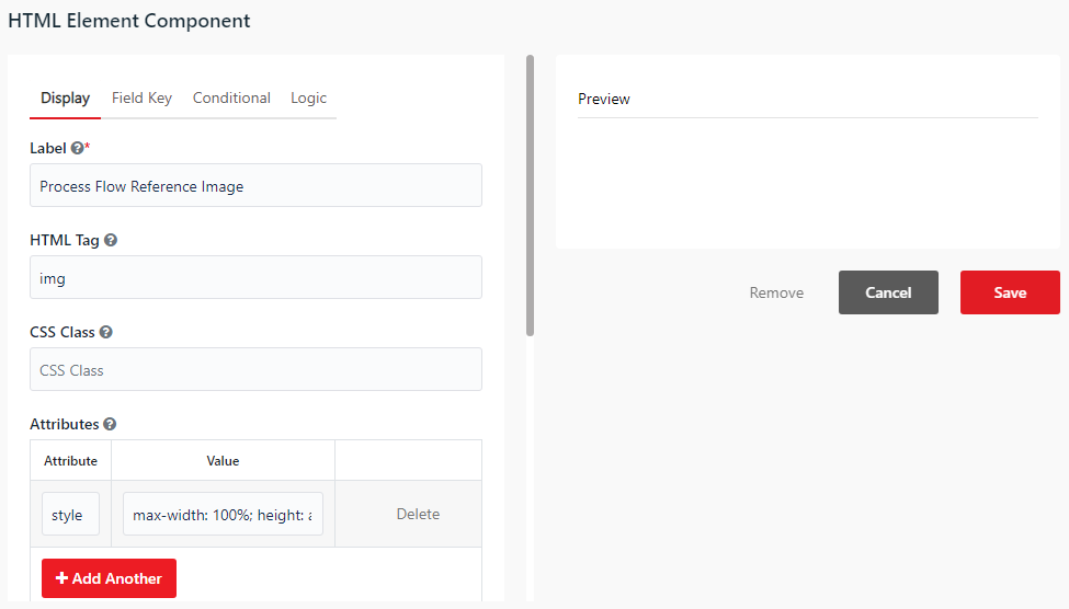
You can use the HTML Element component to render a custom HTML tag directly in the form layout.
- HTML Tag - Specify the HTML tag to render (e.g.
div,span,p,h1). - Content - The raw text or HTML code displayed inside the tag.
- CSS Class - Add custom CSS classes for custom styling.
Content
Data type: None (Layout container)
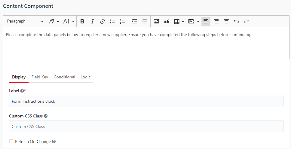
You can use the Content component to display rich text, formatted text, or media elements.
- Rich Text Editor - The text area at the top of the settings window where you can input and format static text, headings, images, and tables.
- Refresh On Change - When checked, re-renders the component content dynamically when another component's value changes.
Columns
Data type: None (Layout container)
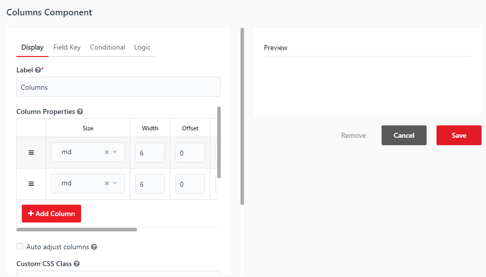
You can use the Columns component to arrange form components horizontally in columns.
- Column Width - Configures the size of each column based on a 12-column grid layout (e.g. 6 and 6 for two equal-width columns).
Panel
Data type: None (Layout container)
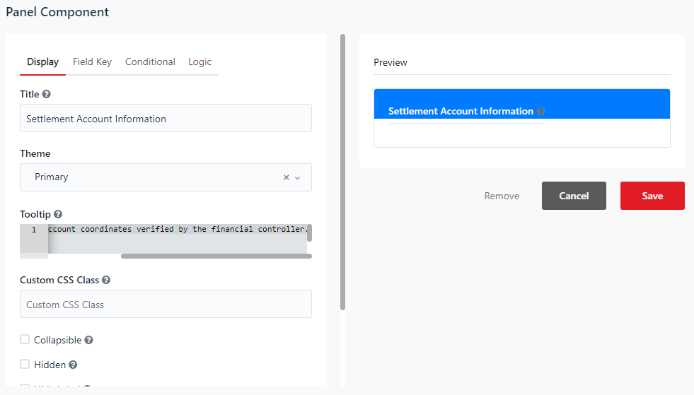
You can use the Panel component to group related components inside a box container.
- Title - The text displayed as the header of the panel.
- Theme - Choose the styling theme color for the panel (e.g. Primary, Success, Warning, Danger, Info).
Table
Data type: None (Layout container)
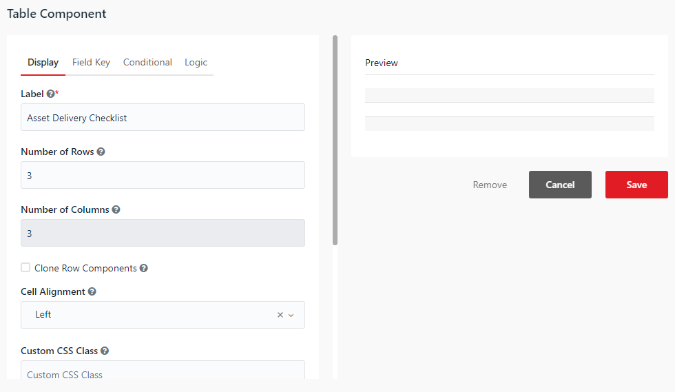
You can use the Table component to create a grid layout (rows and columns) to align and hold other form components.
- Number of Rows - Sets the total rows in the table.
- Number of Columns - Sets the total columns in the table.
- Clone Row Components - When checked, duplicates the components of a row to other rows.
Tabs
Data type: None (Layout container)
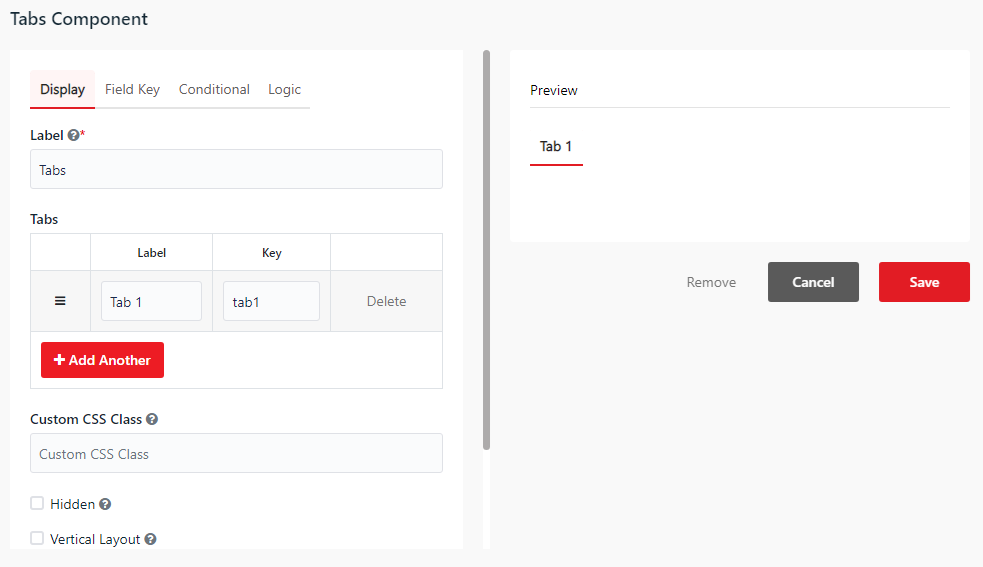
You can use the Tabs component to organize form content into separate tabbed pages.
- Tabs - Add, edit, or reorder the tabs list.