Data Components
Data and grid components available in the Form Designer, including hidden fields, data grids, and editable inline grids.

Hidden
Data type: String (or any type depending on stored data)
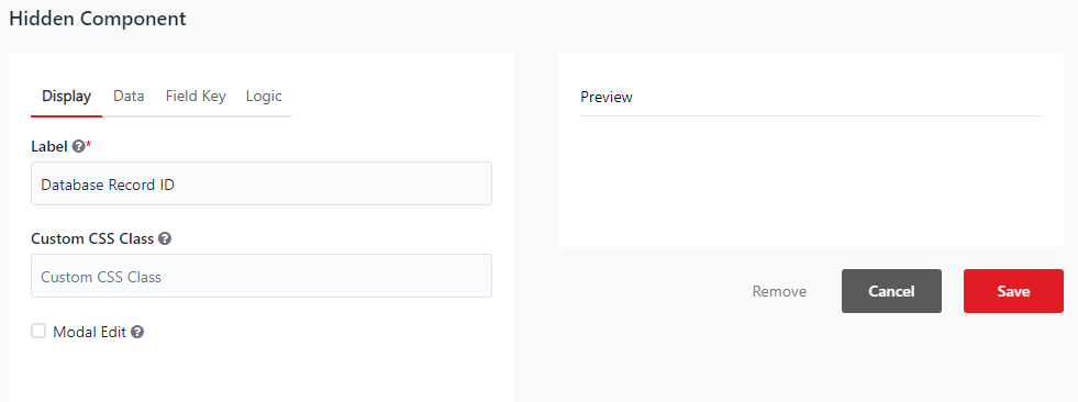
You can use the Hidden component to store data that is submitted with the form but is not visible to the end-user.
Data Grid
Data type: JArray (Array of JSON Objects)
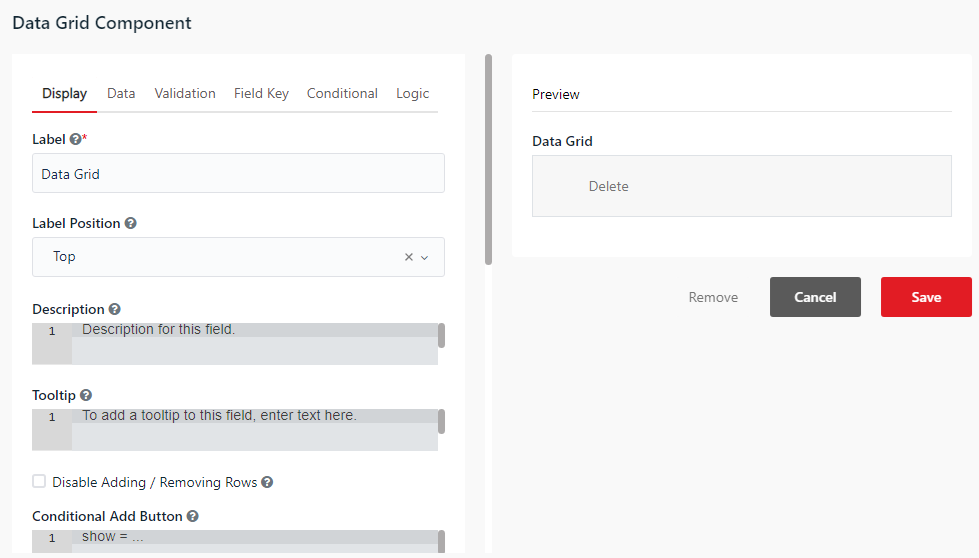
You can use the Data Grid component to group and display multiple rows of components. This component is commonly used to bind DataTable variables for displaying tabular data.
- Disable Adding / Removing Rows (Display tab) - When checked, prevents users from adding or removing rows in the grid.
- Add Another Text (Display tab) - Sets the label for the button used to add a new row to the data grid.
Edit Grid
Data type: JArray (Array of JSON Objects)
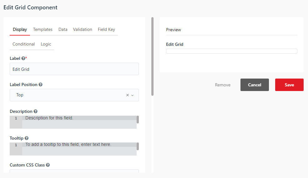
You can use the Edit Grid component to group and edit multiple rows of components inline. It allows users to edit, add, or duplicate rows of data dynamically.
- Open First Row when Empty (Display tab) - When checked, automatically opens the first row for editing when the Edit Grid is empty.
- Disable Adding / Removing Rows (Display tab) - When checked, hides the buttons that allow users to add or remove rows in the grid.
- Add Another Text (Display tab) - Sets the custom label for the button used to add a new row to the grid.
- Save Row Text (Display tab) - Sets the custom label for the button used to save changes to the current row.
- Remove Row Text (Display tab) - Sets the custom label for the button used to delete a row.
The Templates tab is specific to the Edit Grid component. The Header, Row, and Footer Templates allow you to customize the grid layout and display using JavaScript (Lodash templates):
- Header Template - The HTML Lodash template used to render the header of the Edit Grid.
- Note: The Header Template does not work with Form Actions.
- Available variables:
value- The array containing the row data.components- The array of components defined in the grid.
- Row Template - The HTML Lodash template used to render each row of the Edit Grid.
- Note: The Row Template does not work with Form Actions.
- Available variables:
row- The data object for the current row.components- The array of components defined in the grid.state- The current row state (draftorsaved).
- Tip: To enable row editing or deletion via custom template clicks, add the
editRowandremoveRowCSS classes to the respective elements.
- Footer Template - The HTML Lodash template used to render the footer of the Edit Grid.
- Available variables:
value- The array containing the row data.components- The array of components defined in the grid.
- Available variables: